Letting logic have its mic-drop moment.
Fallacy Detected is a small web tool designed to make online debate slightly less exhausting. It lets people respond to broken logic with a link instead of a paragraph — and then move on with their day.
A shortcut for calling out bad arguments.
Fallacy Detected
Understanding the Problem
Online discussions tend to fail in predictable ways. Logical fallacies show up early, repeat often, and quietly drain energy from the people trying to engage seriously.
Fallacy Detected started from a simple observation: explaining why an argument doesn’t work usually takes far more effort than making the argument in the first place.
It's not enough to be right
In practice, calling out a fallacy mid-thread usually means:
- Writing a careful explanation that no one reads
- Sounding condescending or triggering defensiveness, even when you’re not trying to
- Rewarding bad behavior with attention and time
The site was designed as a shortcut. Instead of re-explaining the same ideas over and over, people could drop a link that did the explanatory work for them.
Importantly, this tool isn’t about “winning” arguments. It’s about conserving time and emotional energy for people operating in good faith — especially when it’s already clear the conversation isn’t going anywhere productive.
“It’s weirdly calming? Like, I can just drop the link and stop typing.”
Quote from a user test participant
Tone & Visual Language
Logical fallacies are, by definition, corrective. The design challenge was making that correction feel procedural rather than personal.
Saying it in a way that people can hear
Michele Rosenthal’s robot illustrations provided the key tonal shift. Robots are literal, a little awkward, and emotionally buffered. They create just enough distance between the idea and the person holding it.
The site design leaned into that framing:
- Bright, approachable colors
- Soft, rounded typography
- Playful motion that feels expressive, not aggressive
Some robots shout. Some flail. Some blink calmly while chaos unfolds next to them. The energy is intentionally uneven — expressive enough to feel alive, but never hostile.
Close-ups of robot illustrations
The goal wasn’t to eliminate emotion, but to redirect it. The site should feel less like an argument and more like a reference manual that happens to have personality.
This approach allowed Fallacy Detected to function as a form of friendly de-escalation: pointing out flawed reasoning without escalating the tone of the conversation itself.
UX Considerations
Most sites optimize for reading or engagement. Fallacy Detected optimized for being dropped into the middle of someone else’s conversation.
That shift shaped nearly every UX decision.
Micro-interactions that lower the temperature
The homepage establishes the dynamic immediately: two robot heads facing each other, with a speech bubble between them inviting exploration. Instead of presenting a dense list, the interface suggests a conversation already in progress.
Each fallacy page follows a consistent visual rhythm:
- An agitated orange robot presents a broken argument
- A calm blue robot responds with a concise definition
- Motion reinforces the contrast: erratic (but silly) gestures vs. steady, measured movement
Animations unfold in sequence rather than all at once. Speech bubbles slide in, signals appear, responses follow. Nothing competes for attention. The pacing does some of the emotional work for you.
Animation examples
Hover states are soft and forgiving. Transitions are smooth. Even navigation between fallacies happens without a full page reload, keeping the experience grounded and continuous rather than jarring.
Small affordances reinforce the site’s primary use case:
- A persistent “Copy URL” button for fast sharing
- A “Learn More” option that stays out of the way unless needed
Even the logo participates. Hovering over the robot head causes its mouth to chatter briefly as a speech bubble fades in: FALLACY DETECTED. It’s a small moment, but it reinforces the idea that this site exists to speak once — clearly, playfully — and then stop.
Sharing as the Primary Interaction
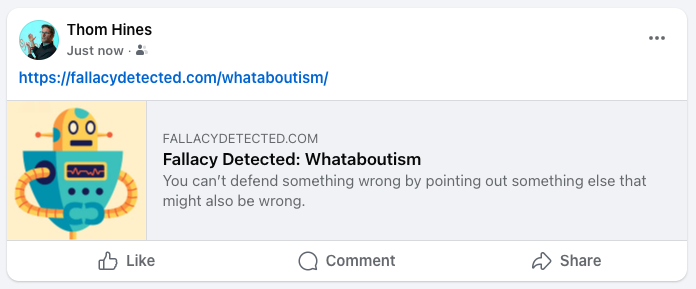
Facebook/X link preview example
The core UX flow wasn’t browsing — it was sharing. That meant designing links that worked even when the site itself was never visited.
Social previews were treated as first-class UI:
- Titles that made sense without surrounding context
- Descriptions that explained the fallacy at a glance
- Visuals that communicated tone before text
In many cases, the preview was the experience. If someone never clicked through, the tool still did its job.
The result is something that can intervene briefly in a conversation, clarify the issue, and then disappear — ideally without dragging anyone deeper into the argument.
“Honestly, half the time I don’t even care if they click it. The preview alone does a lot.”
Quote from a user test participant
Findings & Takeaways
Fallacy Detected is intentionally modest. It doesn’t try to host debates, resolve disagreements, or “fix” the internet. It intervenes briefly, does one job clearly, and then steps aside.
That constraint wasn’t incidental — it was the design.
UX is often about restraint
Most online tools reward escalation. More replies, more notifications, more surface area for misunderstanding. This project explored the opposite question: what happens when a system is designed to end an interaction instead of prolonging it?
A few lessons became especially clear:
That constraint wasn’t incidental — it was the design.
Tone is part of the interface
Visual language, animation pacing, and even illustration style shape how corrective information is received. A calm presentation can do as much work as the words themselves.
Sharing context is a primary UX surface
For Fallacy Detected, the link preview often mattered more than the page. Designing for copy-paste behavior meant treating off-site contexts as first-class environments, not afterthoughts.
De-escalation can be designed
Reducing defensiveness isn’t just a social skill — it’s an interaction design problem. Friendly abstraction (robots), emotional buffering, and neutral framing helped keep corrections from feeling personal.
Doing less can make something more usable
There are no comments, no scoring, no “next steps.” The site resists engagement loops on purpose. Its success depends on how quickly and cleanly it can deliver clarity — not on how long it can hold attention.
Ultimately, Fallacy Detected reinforced a belief that shows up across my work: good UX doesn’t always push users forward. Sometimes it helps them stop, name the problem, and move on.
When a system can clarify a moment and then get out of the way, that’s not a lack of ambition. It’s discipline.