Cinematic Interfaces
A multi-sensory
designed experience
Designing on-screen interfaces for film means creating UIs that must feel real, read clearly on camera, and serve the story — all without the audience ever “using” them.
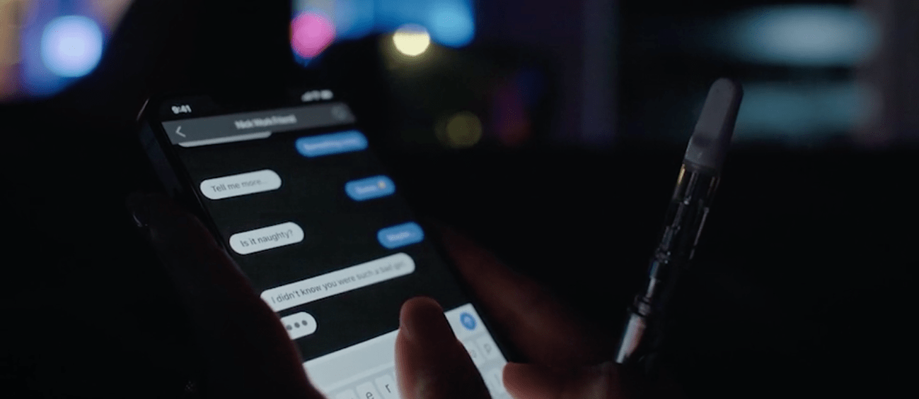
A texting app (Figma prototype) made for You Will See Us
Understanding the Problem
Film is a mountain of designed user experiences. Editing controls attention. Sound shapes emotion. Pacing governs comprehension. When any of those elements misfire, the viewer feels it immediately — even if they can’t articulate why.
This is especially true for on-screen UI. They are interfaces without users. The viewer never touches them, but they judge them instantly. If an app feels fake, sluggish, confusing, or visually off, it breaks immersion just as quickly as bad dialogue or a sloppy edit.
When Interfaces Break the Spell
On-screen interfaces fail in film for the same reason bad props do: they aren’t designed to be scrutinized.
Most movie apps are static, over-designed, or oddly sluggish. They rely on dense text, implausible layouts, or “cool” animations that don’t match how real software behaves. They may look fine in isolation, but once a camera lingers — or a character actually interacts with them — the illusion collapses.
Viewers are extremely good at detecting this kind of fakery. Even non-designers can feel when something is off. The response isn’t analytical; it’s visceral. Attention breaks and the story loses momentum.
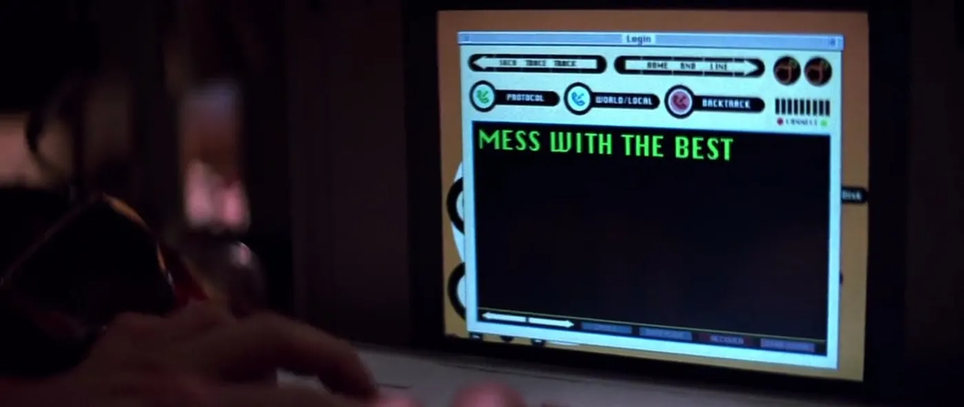
An example of a poorly designed cinematic UI from the film, Hackers
In both films we've released (both written and directed by Jennifer Wolfe and shot by director of photography, Maggie Kirkland), the apps weren’t background details. They were narrative devices. Characters made decisions through them. Tension depended on them. If the interfaces failed to feel real, the story failed with them.
The challenge was to design interfaces that worked on three levels at once:
- As believable, realistic, internally consistent apps
- As tools actors can use effortlessly under pressure
- As visual elements that read instantly and understandably inside a composed shot
Because I was also deeply involved in editing and sound design, I was thinking constantly about how the viewer would experience these moments, not just how the interfaces looked in isolation.
An interface that responded too quickly felt fake. One that responded too slowly felt broken. Color and hierarchy were essential considerations for instant comprehension. Small delays, micro-animations, and loading states became emotional tools, not just UI conventions.
This framing shaped everything that followed. These weren’t apps designed for onboarding flows or usability testing. They were designed to support storytelling without calling undue attention to themselves.
A well-designed film UI from one of our films
"On-screen interfaces don’t get the benefit of doubt. They have to earn it immediately."
Research & Constraints
Unlike typical product work, these interfaces would be:
- Filmed at close range
- Viewed by a passive audience trained to spot fakery
- Used repeatedly across multiple takes
- Operated by actors, not designers
And because these were low-budget productions with tight shooting schedules, restoring the app to a neutral state had to be fast. Actors needed to manage the devices themselves; there was no time for troubleshooting between takes.
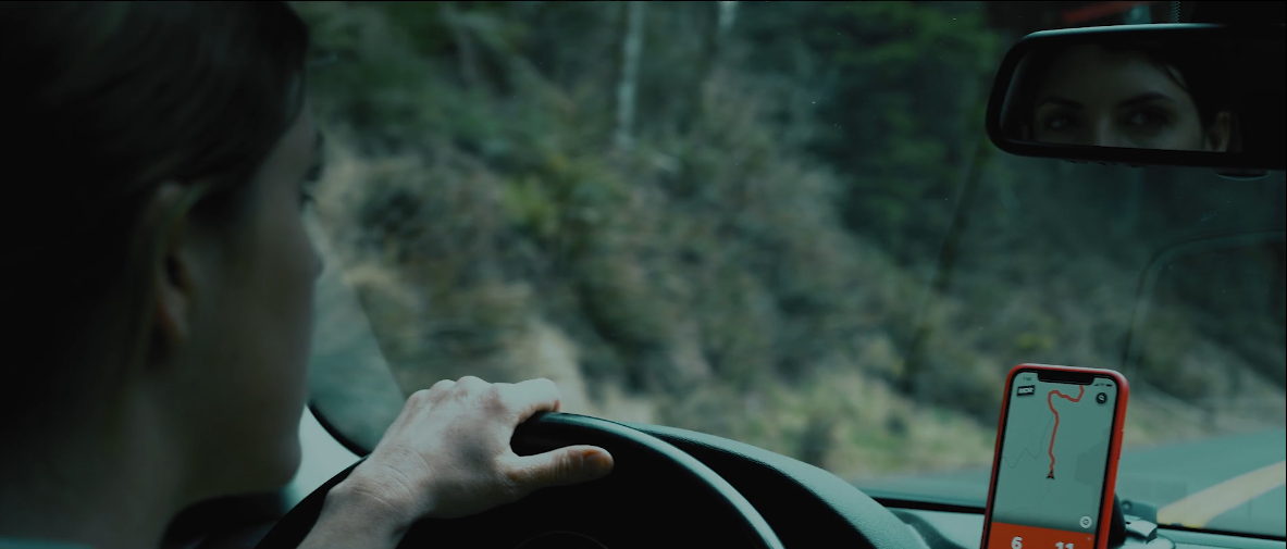
A ride-share app (Figma prototype) from the film You Will See Us
Reality, under a microscope
I built the apps as high-fidelity Figma prototypes using Smart Animate, timed transitions, and invisible navigation and reset triggers. For example, in scenes with texting, tapping anywhere on a keyboard advanced the on-screen text so it looked realistic but was hard to screw up. Delays and animations simulated “typing on the other end.” Maps could be panned realistically. Ride-share routes animated smoothly.
Actors could focus entirely on their performance. The director could trust that the screens would behave predictably. And production never stalled waiting for a device to be “set back up.”
This constraint — never slow down the set — became a UX principle in its own right.
UX Considerations
These interfaces had to work within a larger visual system: the frame.
Color, hierarchy, contrast, and motion weren’t just about usability — they were about legibility from across a room, under specific lighting, through a lens, and ultimately on the viewer's screen.
A screenshot of the dating app in You Will See Us
Every interface was designed twice:
- Once as a believable app
- Again as a compositional element inside the shot
For the dating app in You Will See Us, I leaned into saturated pinks and reds. It fit the emotional tone of the app — but more importantly, it popped visually, even when the phone was several feet from the camera.
For the rideshare app, I avoided the familiar “tech blue” entirely. Routes and accents were red. Red reads instantly. It also subtly signaled danger — and sat intentionally against a cool, blue-heavy color grade in the film.
In Happy Ending, the gallery and messaging apps were designed to disappear just enough. They felt familiar, frictionless, and boring in the best way — which allowed the audience to focus on what the content meant, not how the interface worked. In these cases the content was the only thing that mattered, and so it was essential that the rest receded visually without looking fake.
Visual & Emotional Design
Actors shouldn’t have to think about an interface. It should as effortless and mindless as possible.
That meant designing interactions that were obvious without being theatrical, responsive without being distracting, and forgiving under pressure. These weren’t demos — they were tools used mid-performance, often under emotional and logistical stress.
Hidden reset zones allowed instant recovery between takes. Overlapping tap targets prevented missed inputs. Motion reinforced state changes without requiring focused attention. Nothing depended on precision, memory, or perfect timing on the part of the actor.
These details weren’t about realism for its own sake. They were about protecting the performance. An actor worrying about whether a screen would behave correctly is an actor pulled out of the scene.
Because I was also editing the films, I could see exactly how small interaction choices affected pacing. A delayed response could heighten tension — or accidentally drain it. An animation that lingered too long could compete with a line of dialogue. Every micro-decision had downstream consequences.
The goal was simple: make the interfaces trustworthy enough that everyone could forget about them.
That’s a familiar UX principle in an unfamiliar context: when stakes are high, the system’s job is to absorb uncertainty — quietly, reliably, and without asking for attention.
“The apps [in You Will See Us] were the some of the most realistic apps I’ve ever seen in a film...
They looked absolutely real.”
- Hans C., L.A.-based director & producer
Findings & Takeaways
Lessons from designing interfaces no one touches
Key takeaways:
- Believability is a UX outcome. If something feels fake, it detracts from the experience.
- Timing is emotional. Delays, pauses, and transitions shape feelings.
- Context is everything. Interfaces don’t exist alone — they exist in systems.
- Good UX disappears. Especially when the audience isn’t supposed to notice it.
- Emotion is not incidental. It’s the job.
Why this matters outside film
Most products aren’t watched through a camera — but they are experienced emotionally. People bring context, expectations, and stress with them. They judge systems instantly. They feel friction before they understand it.
Designing for film sharpened my instincts around pacing, clarity, and emotional alignment. It reinforced a belief that runs through all my work: UX isn’t about screens. It’s about how people feel while moving through a system — whether they’re tapping a button, watching a scene, or just trying to get something done.
Happy Ending