Todo lists seem like they should be easy
After all, you can scribble one on a post-it note in seconds. But post-it notes don't scale well, and people have a lot to manage. MindHive was designed around a few truths of how human attention actually works.
Fewer decisions. Less clutter. Clearer focus. Effortless action.
MindHive
- Understanding the Problem: Todo lists are... complicated
- Competitor Analysis: Looking at how other todo list apps fail
- UX Explorations & Approaches: Reducing decision fatigue and cognitive load
- UI & Branding: Making it feel human, playful, and encouraging
- Findings & Takeaways: What we learned from testing MindHive
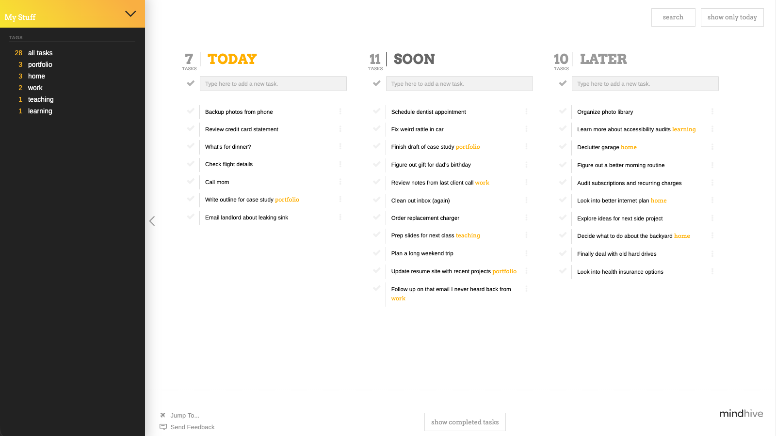
MindHive in action
Understanding the Problem
Most to-do apps are built as if their users aren’t human — as if attention is unlimited, memory is perfect, and context never shifts. In reality, people are busy, distracted, overloaded, and constantly switching between responsibilities.
At its core, a to-do list has three essential jobs:
- capturing tasks
- organizing them
- helping you know what to do next
The trick is to do them in a way that works with the brain, not against it. Most todo lists apps add so much structure, choice, and visual clutter that they solve one problem by creating several new ones.
Tasks are easy, but todo lists are not
In practice, digital task tools often overload users with decisions, categories, and competing signals for attention, all of which work completely at odds with how the human brain works. Too many visible tasks compete for focus (cognitive load). Too many options slow people down (Hick’s Law). Too much structure asks users to manage the system instead of their work (Miller’s Law).
We see this play out in a few common failures:
- Users spend more time organizing than doing
- Important tasks get buried under less relevant ones
- People disengage when the system becomes too complex to maintain
Underlying all of this is a simple truth: human working memory is limited, and attention fragments easily when everything is presented at once. When a tool ignores those limits, it forces the user to compensate — and that’s where overwhelm sets in.
How things can look when task apps are designed in ways that overwhelm rather than help.
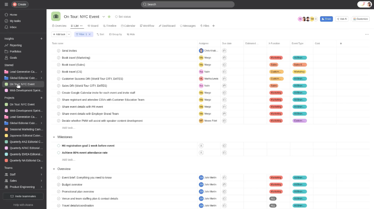
What about large teams and projects?
Many todo list apps are designed with large, complex projects and robust interconnected teams of people in mind. Especially when it comes to corporate and enterprise contexts, this makes a lot of sense. But the fact that these teams are made up of individual people, who each have to accomplish their own set of tasks, is often ignored. Sprawling todo list apps can perhaps help supervisors get a birds-eye view of their team's goals, but they can also create a lot of noise and confusion, even when the majority of the time each person simply needs to keep working through their own list.
At the end of the day, it's still up to the individual to get things done, and they need a tool that helps them do that first and foremost.
A human-centered, task-focused approach
So instead of asking people to work harder at being organized, MindHive approaches the problem with the assumption that unnecessary complexity is the real problem.
- Start with simplicity; add control only when it’s actually needed
- Hide anything that doesn’t apply to the current moment
- Reduce decisions wherever possible
- Let the system do the remembering and resurfacing
The result is a task environment that adapts to how people actually think, instead of demanding that people adapt to the tool.
People feel a lot of stess when they open their to-do lists.
The problem isn’t the tasks.
The tasks are the point.
Competitor Analysis
To understand where things fall apart, I looked at how other todo list apps shape user behavior. Most tools had some very clever and sophisticated features, but they often fell short in when applied to anything besides very specific use cases. They tended to fail because they either misunderstood the role of a todo list app or, worse, misunderstand how people think and why they need todo lists in the first place.
Throwing complexity at the problem
In order to get a better sense of how different approaches might task management, I evaluated a number of todo list apps by looking at the following characteristics:
- How apps support cognitive offloading
- How much friction is required to add and/or organize tasks
- Whether users can clearly see what they should do right now
- Whether the app guides behavior or expects the user to manage everything
- Where overwhelm and over-structure creep in
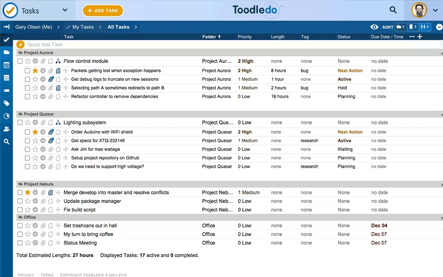
Todoist
Todoist aims to be the highly structured, cross-platform task system that helps people organize complex personal and professional workflows. While Todoist excels at power and precision, its structure can feel heavy-handed — especially for users who already feel overwhelmed.
Strengths
- Extremely flexible tagging, labeling, and filtering
- Great for long, complex projects
- Solid recurring tasks and reminders
- Clear hierarchy
- Mature integrations and automation (Zapier, calendar, email)
Weaknesses
- Requires setup before it feels useful
- Can become visually and cognitively dense
- Easy to over-organize and “manage the system” instead of working
- Color and priority indicators can create stress, not clarity
“Too much information and too many sections… [no way to] hide task details… and overall… it often feels like extra effort to manage tasks…” *
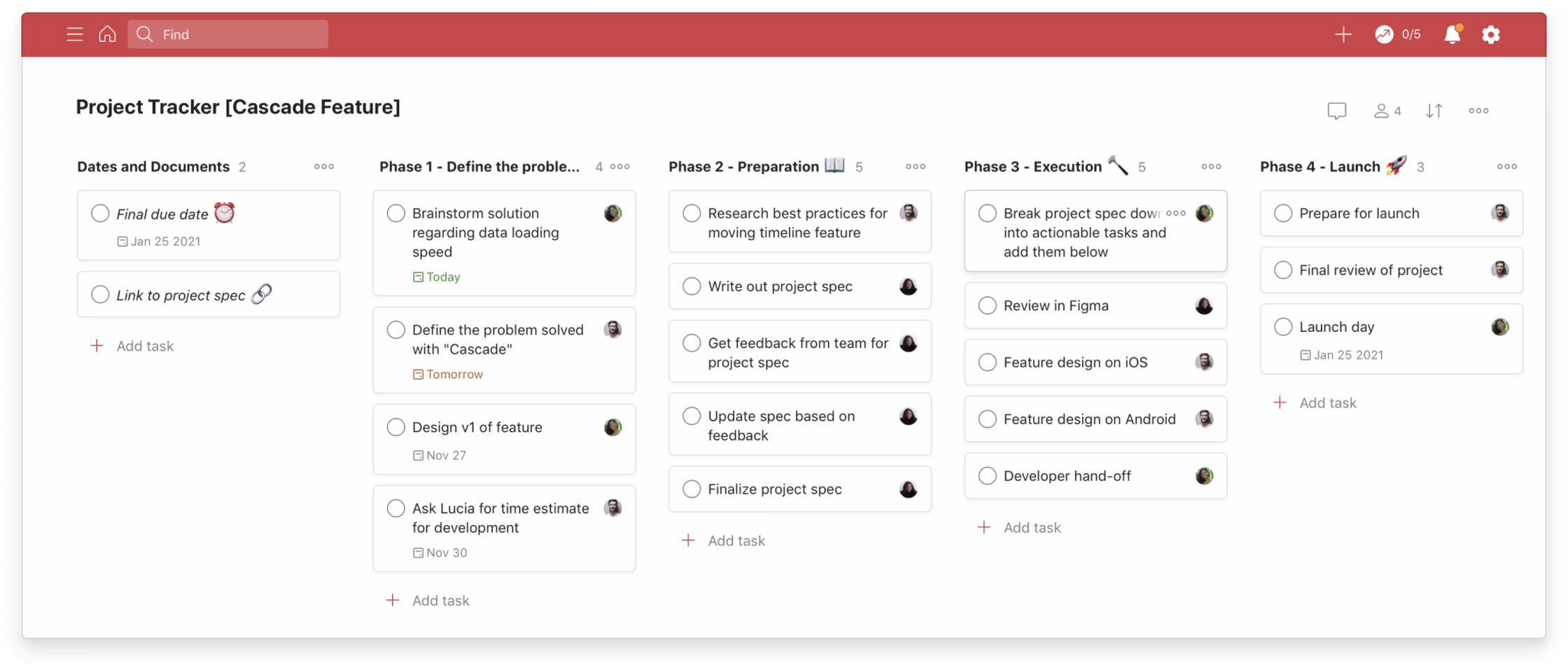
Asana
Asana is built as a project management platform focused on visibility, accountability, and team coordination at scale. Its strength is collaboration — but for individual users or small teams, the interface can feel like too much overhead for simple task execution.
Strengths
- Excellent for team communication and shared workflows
- Clear task ownership and dependencies
- Many visual modes (boards, lists, timelines)
- Great for tracking work across departments or teams
- Detailed notifications and assignment tools
Weaknesses
- High cognitive load for simple personal tasks
- Requires continuous maintenance to stay usable
- Many features go unused unless you’re part of a large team
- Notification noise can become overwhelming
"Asana works well for team projects, keeps things organized, but can feel a bit much at times. Good for bigger projects, but maybe overkill for simpler stuff" *
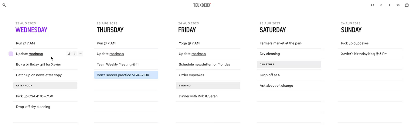
TeuxDeux
TeuxDeux aims to be a beautifully simple, calming to-do list that mirrors how people sketch lists on paper. The simplicity feels refreshing — but once your task list grows or becomes multidimensional, the limitations show quickly.
Strengths
- Minimal, calming interface
- Natural daily-list layout
- Easy to drag tasks between days
- Great for light personal planning
- Very low friction for simple use cases
Weaknesses
- Doesn’t scale well for complex projects
- Limited organizational tools (tags, contexts, etc.)
- Hard to manage tasks that don’t belong on a day
- Tasks quickly pile up if not completed on time
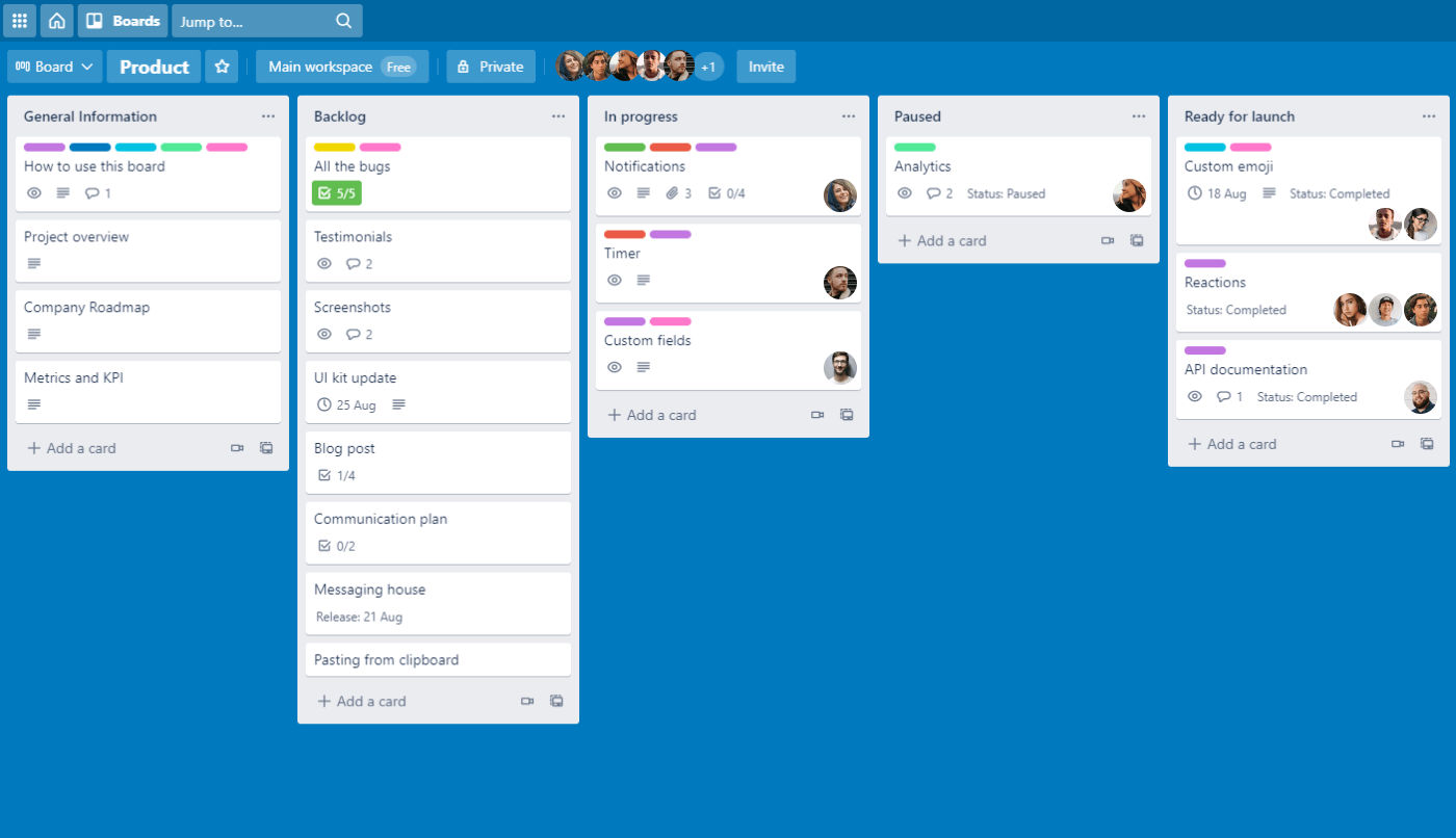
Trello
Trello emphasizes flexibility and visual thinking, giving users a blank-canvas board to organize tasks however they like. Trello’s openness is refreshing, but without structure, systems quickly become chaotic — especially for users juggling multiple contexts.
Strengths
- Very easy onboarding and immediate understanding
- Highly visual boards
- Great for collaborative brainstorming
- Flexible and customizable
- Power-ups add deeper functionality when needed
Weaknesses
- Lack of structure leads to cluttered boards
- Cards tend to accumulate instead of move
- Harder to maintain long-term discipline
- Not ideal for task prioritization or time-sensitive work
“The new interface is not only visually cluttered and counterintuitive, but it also disrupts the basic functionality that users relied on. The way information is now displayed on each card is messy, confusing, and makes it nearly impossible to track tasks efficiently.” *
Each of these tools works to address one piece of the puzzle — structure, visualization, simplicity, collaboration — but none find the right balance for the average user. Most either overwhelm users with features or leave them without enough guidance. MindHive worked to solve the whole problem, not just part of it.
UX Explorations & Approaches
MindHive's UX is built around one guiding principle: reduce everything that creates friction or overwhelm. The entire flow is shaped so that users can focus on just one thing at a time—collecting tasks quickly, organizing them lightly, and surfacing only what matters right now. Everything that isn't essential is made unotrusive, so users can focus on the task at hand. Small design choices compound to create a sense of calm, speed, and mental clarity.
Removing interruptions
To get this feeling right, we focused on removing interruptions, hiding irrelevant information, and shrinking cognitive load wherever possible. Research around working memory, attention, and the cost of context-switching shaped almost every decision: the fewer decisions a user has to make, the more likely they are to stay focused and actually finish their tasks.
Some example UX decisions include:
Hide everything except "Today"
Users can collapse everything except their Today list, reducing visual noise and helping them avoid task paralysis. This deliberate narrowing of focus aligns with how people naturally handle complexity: by sequencing, not juggling.
Type anywhere to add a task
Any keystroke sends the cursor to the task entry box. This creates near-zero friction for capturing tasks and prevents users from breaking flow to find the right UI element.
Hash-tags for higher-level organization
Filterable hash-tags allow users to create higher-level categories and contexts for their tasks, without having to create a new list for each one. This helps keep things organized and easy to find later.
Automatic task resurfacing
Tasks move from Later → Soon → Today as deadlines approach, so users don't need to remember or manually reorganize. The system does that cognitive offloading for them.
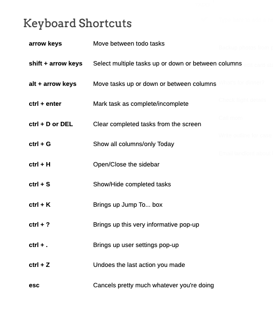
Keyboard shortcuts for everything
Users who work fast or prefer keyboard-driven interactions can navigate the entire app without touching the mouse, dramatically reducing micro-delays and input switches.
Encouraging "micro-rewards"
When a task is completed, small celebratory messages like "Nice!", "Work it!", or "Done!" appear. These details seem tiny, but they reinforce progress and keep momentum going. As cheesy and unnecessary as this might seem, these messages were by far one of the most commented upon and appreciated details by reviewers and testers.
All together, these UX choices work toward a simple idea: Remove what doesn't matter, elevate what does, and help people work the way their brain already wants to work.
“MindHive feels like the bare minimum of what I need a todo list to be. In a good way. It's amazing how little time I need in order to know what I'm supposed to be working on today.”
- John T.
UI & Branding
The visual design of MindHive needed to reinforce its central promise: make task management feel light, friendly, and (where possible) fun. Working with Nice Touch, J Yun, and illustrator Hallie Walker, we created a UI that’s bright, supportive, and not afraid to be a little cheeky. The result is an interface that disarms users, cuts through the usual productivity anxiety, and makes it easier to simply… start.
Most productivity tools take themselves very seriously — dense dashboards, corporate color palettes, and language that sounds like a project manager whispering over your shoulder. MindHive intentionally pushes in the opposite direction. We wanted it to feel human. Playful. Encouraging. Even a little irreverent.
Why? Because when a to-do list feels heavy or formal, users bring their existing stress to it. When it feels light and relatable, the emotional friction drops, and people are far more willing to engage.
To support this, the visual design leans into warmth, clarity, and small moments of personality rather than sterile “professional” polish. MindHive uses:
A cheeky, conversational voice
Copy throughout the site and product (“The simplest to-do list app in the Milky Way galaxy.” / “This s*#% is free.”) immediately signals that this isn’t another productivity guilt machine. It’s a tool that helps you breathe.
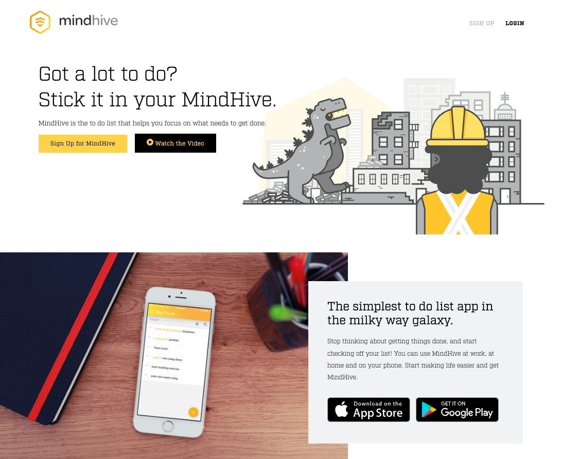
Playful, character-driven illustration
Animated illustration from the MindHive site
Illustrations add a sense of fun and approachability. These aren’t empty decorative assets — they help reframe the emotional experience of task management from “ugh” to “okay, let’s do this.”
Color as clarity, not decoration
Project colors help orient users instantly, but the palette stays friendly, not fluorescent or stressful. Bright accents guide attention; nothing screams for it.
Typography that feels clean and encouraging
We avoided overly serious, tech-product typography. The type system emphasizes readability and warmth — something you feel good looking at all day.
Distracting from the drudgery
The interface is clean, simple, and functional, but it isn’t shy about having personality. It nods to the idea that getting things done doesn’t have to feel like work.
The end result is a UI that feels supportive without being soft, fun without being frivolous, and clear without being clinical — a visual expression of MindHive’s biggest goal: make task management feel like something you want to do, not something you have to power through.
Findings & Takeaways
Testing MindHive reinforced a core truth: people aren’t bad at getting things done — they’re exhausted by the systems that pretend to help. When we removed friction, hid clutter, and let the app do the remembering, users seemed much more at ease. They finished tasks because the app got out of the way, not because it pushed them.
The features that resonated most weren’t the fancy ones — they were the ones that respected cognitive load, made the interface feel “quiet,” and took away the feeling that work was an endless grind.
"It's exactly what I'm looking for in a todo list. Simple, sortable, not too many options."
- iOS App Store Review
MindHive didn’t teach people how to be productive. It reminded them they already were — once the noise was gone.