A study in Designing Delightful Panic
Part tabletop game, part mobile app, part chaos engine — designed to create the feeling of actually flying your ship through a supernova.
Urgency and consequence, structure and chaos, panic and joy… all at the same time
Super Nova Smash!
- Understanding the Problem: The line between playing a game and inhabiting its world
- Research & Playtesting: Chasing the feeling of real-time play
- UX Explorations & Mechanics: Designing for zero-second decisions
- Visual & Emotional Design: Making panic feel playable
- Findings & Takeaways: What real-time game design taught me about UX
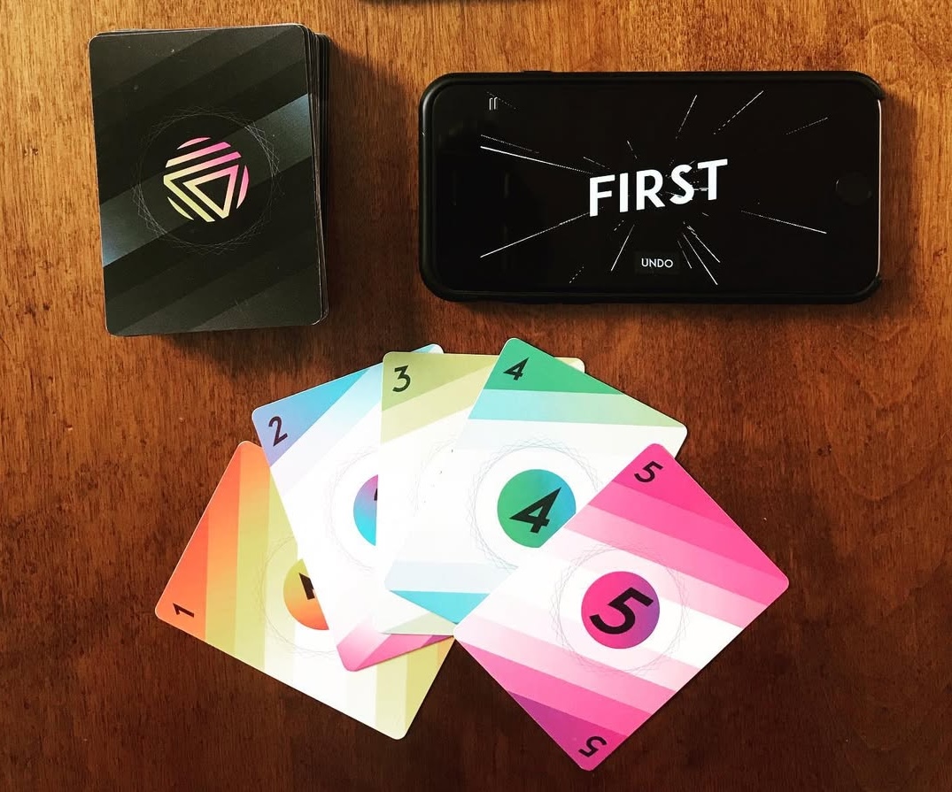
Super Nova Smash cards and app
Understanding the Problem
There’s a concept in game design called the Magic Circle: when people play a game, they leave the patterns and rules of the real world behind and inhabit the space the game creates instead. Some of my favorite games offer deep, transportive stories — but their mechanics often break the spell.
Super Nova Smash began as an exploration of that tension: Could I design a game where the emotional experience — urgency, chaos, instinct — actually matched the story?
I wasn’t trying to “fix” tabletop games. I love them. But I had a couple of experiences that made me question what we think about — and what we feel — while playing.
In one of the game design projects I taught in the Graphic Design program at Portland State University, a student created a game inspired by Japanese samurai sword duels, called Katana. Players try to anticipate their opponent’s move and commit to an action simultaneously. Outcomes are instantaneous and decisive. Every element — the story, visual design, card layout, and rules — worked together to create a sense of quiet, coiled tension. Despite the fact that you battle with cards instead of swords, Katana felt like the kind of duel you might see in a Kurosawa film.
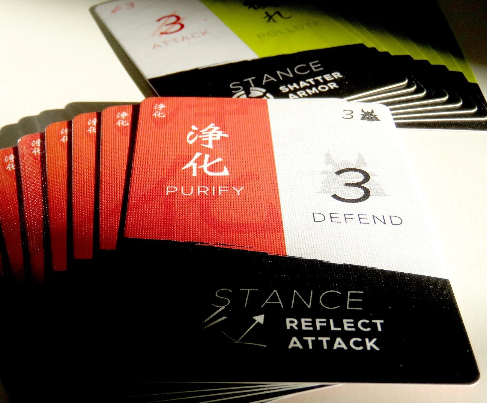
Katana, designed by Tracy Alan
Around that same time, I was in a group who regularly played the role-playing game, Dungeons & Dragons. For those of you who have never played, D&D is a game built entirely around imagination and immersion. Its combat systems, which utilizes a fairly complex system of dice rolls and and stats, often produces something like the opposite of immersion. A battle that lasts moments within the story can take an hour or more at the table. Players pause to calculate, optimize, and negotiate rules. It’s still fun — but attention shifts away from excitement and danger and toward minutiae and logistical details.
That contrast stuck with me.
I wanted to better understand the boundary between playing a game and inhabiting its world. What would happen if I designed a system where the mechanics enhanced the feeling of the story, rather than pulling players out of it?
With Super Nova Smash, I worked to create an experience where those elements were in alignment. The emotional setting was fast-paced, reckless, high-stakes chaos — a feeling that players could feel immediately. The UX challenge wasn’t just speed; it was making sure player choices still felt meaningful even when they had to be made very, very quickly.
What emerged early was a simple truth: creating fun panic is harder than it looks. And solving it requires designing the game, the interface, and the human experience at the same time.
Before building the app or designing the cards, I defined three core UX jobs the system needed to solve:
- Orient players instantly — who can act, where, and when
- Minimize rule complexity — so choices feel fast, not fragile or *gasp* boring
- Let chaos happen safely — mistakes must be understandable and recoverable without breaking the flow
Once those constraints were clear, I started designing.
The 'GO!' text pulsing within the game screen
“The problem isn’t the tasks. It’s everything the tools make you deal with around the tasks that get in the way of getting things done.”
Research & Playtesting
Playtesting Super Nova Smash revealed something I didn’t fully anticipate: once the game started, players barely looked at their phones at all. They entered a kind of tunnel vision — focused on their cards and the rapidly-dwindling time... but pretty much nothing else.
Across version after version, different mechanics were tested, added, and discarded. In nearly every iteration, the same pattern emerged: we were repeatedly running into the limits of what a human brain can handle under pressure.
As we got closer to something that felt doable (but just barely) it became important (and fun) to keep the gameplay riding that line. That behavior reshaped nearly every design decision that followed, and ultimately led to the current version of the game.
The Emotional Impact of Game Mechanics
In the early stages, I explored a wide range of mechanics in an effort to find the right emotional balance. Ideas included:
- Random in-app powerups earned and deployed mid-game
- Playable alien races with unique abilities
- Card suits or colors (similar to Uno) with restrictions imposed by the app
- Health points tracked physically or in-app
- Power meters that bestowed benefits or penalties based on how quickly players played
- An in-app upgrade shop for offensive and defensive abilities
- Etc., etc. etc.
There were literally hundreds of ideas considered — from my own experiments, from other game designers I workshopped concepts with, and from playtesters themselves. Some of these ideas may still resurface in future expansions, but most had to be abandoned.
Testing and iteration consistently pointed in the same direction: every added system increased cognitive load and chipped away at urgency. The more the game asked players to remember, manage, or optimize, the less present they became.
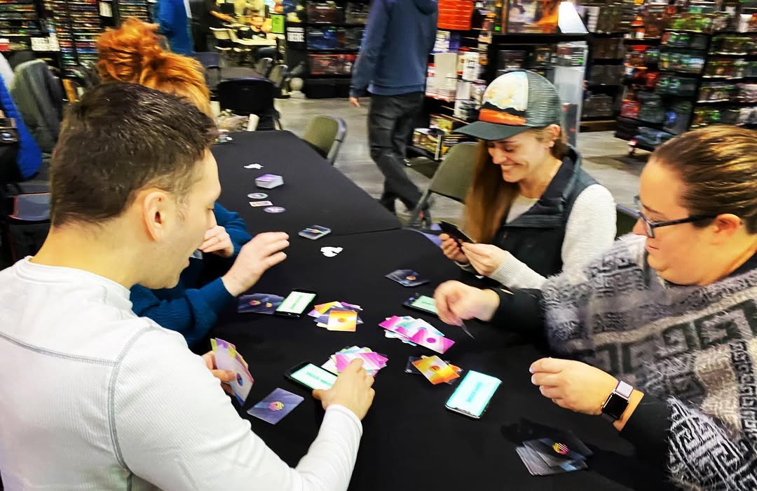
People playtesting Super Nova Smash
Watching People Lose Themselves in the Heat of the Moment
Across several months of playtesting with groups of 4–8 players, a few consistent patterns emerged.
Everyone's an idiot (when it's their turn)
When a player’s turn was active, they basically entered a mild fugue state. Everything outside the card in their hand and the play piles disappeared. Players tracked the game socially — watching hands, listening for cues, reacting to movement — far more than reading text or interpreting icons.
Ambiguity kills momentum
If players had to work out whether they were allowed to act or not, the urgency collapsed instantly. This pushed the app toward extreme clarity: full-screen color states, pulsing transitions, and unmistakable audio cues that removed any doubt about what was happening.
Skill imbalance matters emotionally more than mechanically
Some players were simply faster at card play. Without intervention, that advantage compounded quickly — and then nobody had any fun. This led to Shockwave mini-games, controlled board progression, and negative feedback loops that added friction for players in the lead while giving others ways to stay engaged.
People want to play with (and against) other people
The reason people play tabletop games IRL is because people want to connect with other people. Face-down “damage” cards became a way to punish misplays without stopping the game, but more importantly, it created a playful way for friends to interact (and retaliate) with one another.
Demonstration of the 'payback' mechanic in Super Nova Smash
The game only worked when mechanics, timing, feedback, and emotional pressure were aligned tightly enough that they reinforced one another. When any part drifted out of sync — a rule that slowed momentum, a decision that required explanation, a moment that broke urgency — the experience fell apart.
Successful playtests weren’t the ones where players understood everything; they were the ones where understanding didn’t matter. The system carried them forward, emotionally and mechanically, without requiring analysis. When each component supported the same feeling — urgency without punishment, chaos without confusion — it worked.
UX Explorations & Mechanics
The core UX challenge of Super Nova Smash was deceptively simple: design a system where players had no time to think — and yet never felt lost or that their actions didn't matter.
That meant stripping every interaction down to its emotional and cognitive essentials. If a decision couldn’t be understood instantly, it didn’t belong in the game.
Simple Rules, Consequential Choices
At the heart of the game is a deliberately small decision space. Each card displays a number from 0–5. You can play one number higher or lower than the top card of a play pile. Try to play 0's on your friend's piles and keep them from playing them on yours — that’s it.
This core mechanic created just enough room for strategy without slowing players down. The limited range allowed players to reason at a glance, while still feeling pressure to act quickly. Instead of optimizing, players reacted, which kept the game more in the emotional zone rather than the rational.
Clear, Unmistakable Signals
Early playtests made one thing painfully obvious: text was useless. Players did not read. They did not scan. They barely glanced at their phones.
“GO” and “STOP” alone weren’t enough to cut through the chaos. So the interface was rebuilt around signals that could be understood instantly — even peripherally:
- Full-screen color states: pulsing green for GO, saturated red for STOP
- Large-scale motion and transitions to indicate state changes
- Escalating audio cues to reinforce timing and urgency
Punishment as Feedback
Mistakes were inevitable — and instead of preventing them, the system needed to explain them instantly. If a player misplayed a card (wrong number or wrong timing), that card could be placed face-down on their pile. Face-down cards behave like 0s — effectively “damage” that slows progress. This mechanic accomplished several things at once:
- It punished mistakes without stopping play
- It reinforced consequences visually and socially
- It created moments of playful retaliation and humor
The result was a system that slowed players down just enough — without breaking momentum.
Shockwaves: Controlled Interruptions
Shockwave mini-game in Super Nova Smash
At semi-random intervals, the app triggers Shockwave mini-games (think Mario Party). These sudden interruptions force players to complete fast, physical challenges such as:
- Tapping flying objects
- Swinging their phones like pendulums
- Aiming at moving targets
- Tapping as fast as possible
- Screaming into their phones
Shockwaves reset the emotional arc of play. They interrupt expected rhythms, introduce new skill types, and give less card-dominant players a chance to regain ground — all without adding rules or explanation.
Another example of a shockwave mini-game in Super Nova Smash
Fairness Through Friction
Board in Super Nova Smash
Real-time skill varies wildly from person to person. Left unchecked, that variance can ruin a game.
To prevent runaway winners, several negative feedback loops were introduced:
- A round-based board that guarantees progress for everyone
- Power tokens that favor players who fall behind
- Board milestones that limit backward movement — especially for those already trailing
These systems ensured that chaos stayed playful instead of punishing. Players could fall behind without feeling defeated, make mistakes without feeling stupid, and recover without stopping the game. The result was tension without cruelty — a system that encouraged reckless play while subtly protecting the experience underneath.
“I don’t think I breathed for an entire round.”
Quote from a recent playtest
Visual & Emotional Design
Once the core mechanics were solid, the next challenge was reinforcing the emotional experience through the interface. The app’s visual and audio design needed to do three things at once: signal urgency, reinforce clarity, and heighten the sense of controlled panic — without ever pulling attention away from the table.
Making panic feel playable and fun
Cultural Touchstones
The visual language of Super Nova Smash was heavily inspired by early video games and retrofuturistic sci-fi — especially the Atari 2600 era and the messy, tactile future of Star Wars.
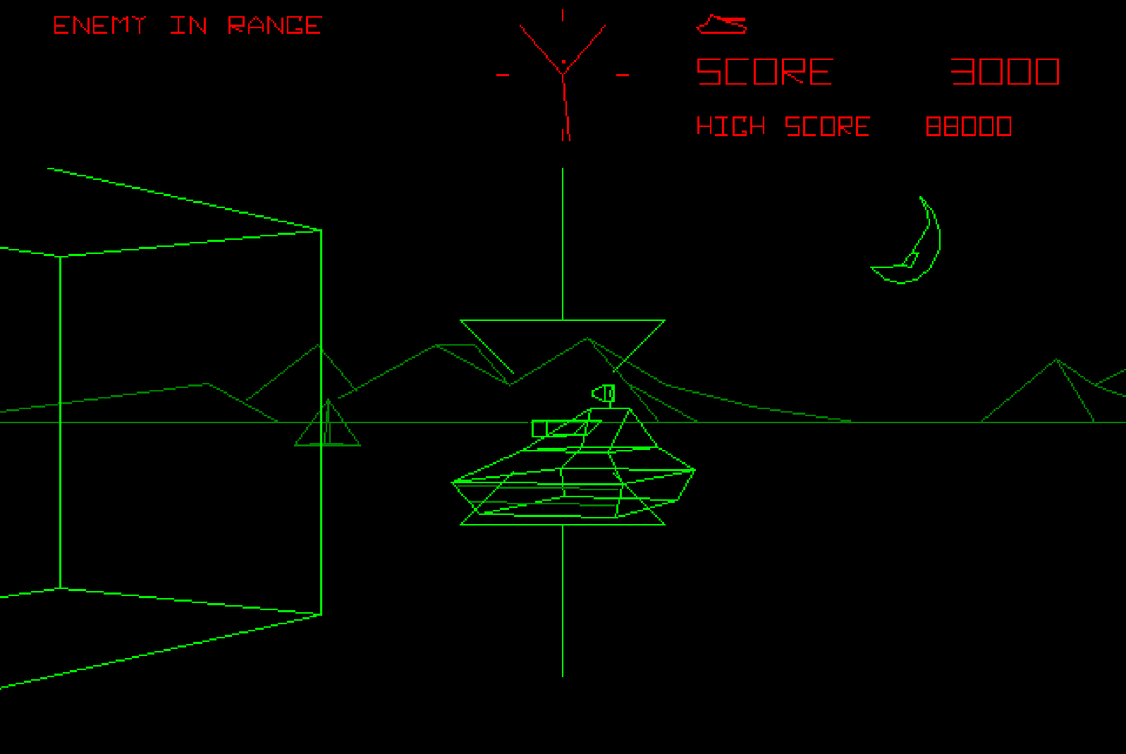
Screenshot from classic video game, Battlezone
Those references weren’t nostalgic for their own sake. Early sci-fi interfaces were simple because they had to be — big colors, bold signals, minimal information. That constraint made them perfect for a game built around instinct rather than interpretation.
Star Wars in particular became a key reference point. Unlike sleek, pristine sci-fi worlds, its technology feels loud, patched together, and slightly broken. Screens flicker. Controls are oversized and have a clear physicality. Systems are fixed by hitting them with a wrench. That chaos aligned perfectly with the game’s emotional goals — and even inspired the voice of the in-game narrator: confident, a little reckless, and prone to calling the player “kid.”
Personality Without Distraction
While the game leaned heavily on urgency and chaos, the visual identity avoided aggression. UI elements, typography, and iconography were designed to feel playful and bold rather than hostile.
Some of the space-station UI chrome (illustrated by Julie West) added just enough narrative flavor to ground the experience without competing with gameplay. The aesthetic supported the fantasy without asking players to think about it.
App as an Emotional Instrument
Players going crazy playing the game
From the beginning, the app was never meant to be the center of attention. Its role was closer to that of a conductor: setting tempo, cueing transitions, and shaping emotion... but mostly staying out of the way.
This meant avoiding dense interfaces or persistent controls. Instead, the app relied on:
- Full-screen state changes
- Large-scale motion and color
- Clear, unambiguous transitions
Players didn’t need to read the interface; they needed to sense it.
Color as Immediate Feedback
Color in Super Nova Smash wasn’t decorative or symbolic — it was immediate. It existed to be read faster than words or even thought. The core interface adopted a green-on-black palette inspired by early computer terminals, Atari-era games, and retro sci-fi displays. That baseline established familiarity and clarity, creating a visual environment that felt utilitarian, legible, and fast. Against that calm, consistent backdrop, additional colors could be used surgically.
Card design in Super Nova Smash
That same logic extended to the card design. Cards furthest from danger (values 2–4) used cool, calm hues — blues and greens — reinforcing safety at a glance. As values approached zero, colors shifted into hotter tones: orange, pink, and red. Even without reading the number — which was printed large and prominently — players could instantly sense the risk profile of each pile.
Color became a parallel information channel. Players didn’t need to stop and assess; they already felt which piles were safe and which were volatile. In a game where hesitation breaks momentum, that immediacy was essential.
Motion, Scale, and Peripheral Vision
Because players often weren’t looking directly at their phones, visual cues had to work peripherally. Large shapes, rhythmic pulsing, and exaggerated transitions ensured that players could understand what was happening without breaking eye contact with the table.
Small UI elements were treated as a liability. If something couldn’t be understood at a glance — or from the corner of your eye — it was redesigned or removed.
Sound as Structure
Sound design ended up carrying far more weight than anticipated.
Early versions of the game relied on subtle audio cues — and players constantly overshot their turns. It wasn’t until an intentionally shrill end-of-round alarm was added that the problem disappeared entirely.
Over time, sound became the backbone of the experience:
- Clear start and stop cues
- Escalating intensity as rounds progressed
- Distinct audio signatures for Shockwaves and transitions
The soundtrack itself (composed by Alexander Margitich) was designed to evolve dynamically, layering and intensifying as rounds continued, then releasing tension between phases. The result was a soundscape that shaped player behavior without requiring conscious attention.
“I didn’t even realize the music was changing — I just felt more stressed…”
— from a recent playtest
Findings & Takeaways
Super Nova Smash removed the safety nets common to most interfaces. If something wasn’t clear, it failed immediately. That pressure made the UX lessons impossible to ignore.
Key UX Learnings
- People process signals, not information.
Color, sound, and motion beat text during moments of urgency. - Urgency exposes weak UX instantly.
Anything that requires deliberation will be skipped or cause hesitation. - Technology should support human connection, not replace it.
The app handled rules, timing, and fairness so players could focus on each other. - Fairness is an emotional UX problem.
Feedback loops and alternate challenges kept everyone invested — even when skill levels differed. - Hybrid systems must feel unified.
Analog and digital components can’t be designed in isolation. Any mismatch is felt immediately.
Why This Matters Outside Games
These lessons apply anywhere people must act quickly, confidently, and together — from collaborative tools and real-time dashboards to onboarding flows, emergency systems, and live services. When attention is limited, clarity becomes emotional. Interfaces that respect human instinct — and stay out of the way — don’t just work better. They feel better.
Closing Thoughts
Super Nova Smash wasn’t about speed... at least not directly. It was about designing for instinct, presence, and shared experience — and building a system that supports those things without asking to be noticed. If players are laughing, panicking, and completely immersed — and the system stays invisible — that’s a good game and, just as importantly, a good UX.
Watch the Video
Watch the video below to see Super Nova Smash in action.